DISTRACTION while walking
gif:
-A walk (any walk)
-The character turns around
-Something obstructing his path
-Character hits object
-Character falls
But let's see the planning here :D
PLANNING
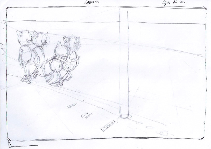
The first ideas came up with a simple character who looks like a cat because of the funny horns I drew on his head. But those are just to figure out the head rotation :P
I began sketching something on the paper (left), exploring some funny poses and important sequences that told the simple story (narrative - what's going on)
I also doodled the way I wanted the walk to be a crazy walk with some spaghetti movements.
Here I laid down some preliminary poses. Designing the movement is important and fun to do. Is spend a lot of time during this phase, writting down ideas that will affect movement, thinking about particular aspects of the walk cycle, etc.
Since the character had to turn around, I began to thing when he was going to do it (top of the page), and also doodled how and with what he crashes.
At the bottom of the page I created the way he was going to begin walking. I noticed I've never designed such a thing before. My characters just came walking through the page, but never began walking XD. In any case, it was a good opportunity to think about it.
I added a quick anticipation to the moment he begins with the step, just to let the audience know something is about to happen.
There is nothing too crazy here, but I wanted to begin exploring something fun with the arms at least.
And, if you remember from my past works, this time I decided to do a simpler set of legs, with a simpler, more cartoony set of joints :P
LAYOUTS
For the drawings I call "layouts" I drew the poses and extremes which I considered the most important ones.
Some spacing can be seen here,
 |
| Beginning of the step - Here I draw the anticipation and how he begins moving his left leg |
 |
| The last layout, when he falls down, rests a little, and then goes to the floor. I added the path his arms were going to follow when falling (blue) |
Timming suffered some changes from the one I build in the beginning.
At first, I was thinking of a huuuge walk cycle, but then noticed the character had to be turning around a little bit more time before hitting the post.
The bar below shows the new timming, where the impact is changed, and there is more hold time for the character to understand what happened to him :P
THE TURN
The turning of the character was something new to me, as well as fun to work with.
I decided he was going to turn his head and upper torso around while his legs would keep walking.
Since the turning happens during the walk, it was important to make the movement natural. Without a good care, the turn could look away from the character's intentions, more like a robot. to avoid that, I mixed the walk with the turn, using the arms' motion to give the eye something to follow, and then turning the entire head quickly.
I added a small blink to it, just to keep it natural ^^


No hay comentarios:
Publicar un comentario