Mostrando entradas con la etiqueta action. Mostrar todas las entradas

martes, 29 de abril de 2014

Otras pocas animaciónes

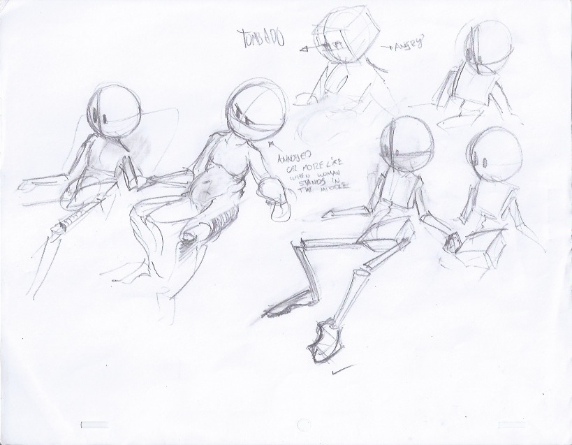
Pues de nuevo colocando animación aquí, quisiera poner algo más tradicional: bocetitos de un personaje que he estado trabajando, algunas animaciónes de él, y un cuadro que porfín está terminado.

Este par de bocetos son una pequeña idea para un ejercicio de animación, con mucha más dinámica que los anteriores :P

"se come el pasto como un sandwich"


En estas dos de arriba estaba tratando de definir las proporciones: su altura, el tamaño de la barriga, que tipo de cuerpo, etc. En lugar de algo muy anatómico quisiera algo más animable y simple, que se reduzca fácilmente a formas básicas, esferas preferentemente.


Y en estos quedó muy vaciado jaja, aunque muy "chiquito" quizá.


Y estos nomas para hacer expresiones random.


---
Y el cuadro terminado, que nació de este boceto de aquí:


Algunas etapas:


Y el terminado:


En fin, es noche y por el momento es todo :P Al rato subo más actualizaciones, que hay muchas cosas que compartir :D

Gracias por leer! (O ver, que ahora no hubo tanto texto)

jueves, 22 de agosto de 2013

Back to school

I'm back again to school, which explains the late update, but here it is, a huge amount of stuff I've done during the last few weeks of summer and this first week of school.


SOME 2D ANIMATIONS DONE AT SCHOOL
-Eased arm
I've done one before. This one has a small anticipation.


-Eased ball


-pingpong ball
I really do not like this one, it has too much spacing. What I wanted to do was to get the timming for a pingpong ball, which has a quick bounce. 
What makes it look even more wrong I think is the squash...
It's lacking a nice cushion at the top of the last bounces, which adds to the lousy movement...


-bouncing marbel 
And this one is much better, with a quick bounce, not much energy is preserved. 


-falling ballon


-falling vase


Hmmm, I think that's it for animation. I havn't done too much with traditional these days... 
I've also worked on some dialogues and words, but those with some 3D characters. When something nice is done I'll show it to you  ;)


<><><><><><><><><><><><><><><>
OIL PAINTING
I've got a lot into oil painting lately. It has a lot more to it than digital stuff, even though it's harder, without instant mistake correction (ctrl+z), and it doesn't dry out instantly either XD-

But it does has a lot of artistic stuff, improves decision making and problem solving.
Here are some of the tiny paintings I've done.

All of them have been done in one sit, taking from 1 to 1:30 hours each. Some made from direct observation, others from imagination, and others from places I've been. 
I saw this scene on the airport, then some days later I made the painting from what I remembered, but mostly liked, about the scene. 

observation

observation

observation

observation

observation

imagination


<><><><><><><><><><><><><><><><><><><><><><><>
ILUSTRATIONS / SCENE STUDIES / NARRATIVE


This picture came to me while reading Crime and Punishment. This scene has to do with the main character walking down the streets, when suddenly hearing some particular conversation that pushes the series of events that makes up the whole story.

It is a really quick picture, focused on the colors and the composition. Figures are not defined, just enough to understand the scene. What I wanted to settle down was the way colors, ligths and shadows, tell a story within a picture. 

In this case, the silhouette, watching from the dark, belongs to the obscure character thinking obscure things. The bright guys in the right side of the scene talk about random stuff, not so random for the main character though, but they are good guys. 

I added a little bit of red just to make a small "prediction" within the picture. Perhaps going too much into the cliché (Red = danger), but it helps tell the message. 

This way of doing pictures, taking inspiration from stories, really puts the basic concepts of art into work, since they are not just created to paint nice pictures, but to make pictures work, or say something. 

--

Here is another picture, this time without a concrete story, but with some words in mind:
afternoon, coffee shop, rain, comfortable, city. 


Yes, it has something to do with the Goat Kid story, it may exist within its world; cluttered buildings, a dirty city, lots of stuff, etc.

What I was looking for here was the contrast with these two colors: yellow and blue, and how yellow, being a warm color, can create a comfortable atmosphere within a blue, cold scenario. 

--

And here is a quick sketch with another character that may be part of the Goat Kid world.

This guy, The mechanic, perhaps is someone that lives alone, building weird things, inventing machines, talking to 
himself, etc. 

He is a cat or something similar. 


And thats all for now! 
Thanks for reading :D 


<><><><><><><>
RANDOM 3D STUFF I FOUND AND DID

Funny smoke


sábado, 20 de julio de 2013

Falling Brick and more 3D

Following that schedule I wrote about the other day, here is the third excercise.

3.- FALLING BRICK
This one has to do with timming to achieve a sense of weight -I think XD
Here is my planning. I decided to give it half a rotation and make it hit hard with the edge.
I noticed that, in this case, the full movement ending suddenly adds a lot to the stiffnes of the object, but what do you think?

I also kept myself from using squash and stretch, since it is a very solid brick, it should not deform at all. BUT, perhaps I could use some kind of stretch to create more impact to the exact moment it touches the ground. 


Here is the outcome:


------
I also did a tiny animation with my goat dude. It was aimed to practice small movements, eyes, and some expressions.

I know he lacks his mouth hahaha but I decided the eyes were enough to tell what's going on.
I have to say I didn't made too much planning on this one, it was more like straight ahead and just from what came to my mind, trying to keep the idea as fresh as possible.

----

Aaand the 3D stufffs!
>>watching some kind of sports<<

Using the same character I used last time on my walkcycles, with a simple rig (no iks, no animation curves) I'm creating a scene in which the character is watching some sports broadcast, having a good time.
I'm using 3 poses to tell the idea:
1)just sitting down watching
2)interest
3)reaction to goal


THE SITTING DOWN WATCHING POSE

 In this pose I want the character to look relaxed, almost uninterested. He is sitting on a sofa, with his shoulders relaxed, hands and arms on the armrests, no tension nor stress.

I went trough some issues with this one, form the position of the soulders, to the overall tension of the body.
In the picture at left I drew some front views of the guy, looking for the way his shoulders and hips would tilt.


The doodles at the top left are the first ones I did with the idea in mind, perhaps too exagerated, they help to explore the strongest poses. I also drew some kind of timming chart to figure out the overall rythm of the scene.

This is the pose I chose in the end. It has a much more relaxed hip, shoulders tilted to the other side, and a straight head.
This sheet has some alternate version, with a very sassy pose, not what I was looking for. His shoulders have too much energy and the hips are way too high. 

INTEREST POSE

Before getting into the actual interest pose I created a tiny anticipation in which the character notices something on the screen, which makes his body go up a little.
This picture shows some studies on how the guy will go from resting to stressed. I was thinking on something getting you to the edge of the seat pose, in which his hips go forward, hands go to thighs and head gets closer to the T.V. I also explored the idea of making a small gesture with his right hand, like arguing with the T.V.
In this frame the character lifts his chest a little, showing some interest on what he is watching. This happens before the entire movement takes place.
Breakdown pose from notice to interest. Arms get closer to body, torso straightens, legs get closer to sofa.

This is the extreme interest pose, in which his head is going forward, and his arms pressing his legs, just as if he is going to jump, but holding in emotion.
 The fact that this guy has no eyebrows, mouths, ears, or something that can create a face expression makes it quite difficult, but leaves the job to the entire body gesture. The pose is the subject I'm trying to get here, on how it can tell the story, even without a character blinking or saying something.


This is the 3D animation. Extremes are done, as well as some inbetweens and breakdowns.

Timming is also done, but it doesn't read as much with the long hold frames.


And that's all for today guys! No picture making this time. I did worked on some stuff, but is not dry enough to scan it... :P

Thanks for reading and see you later!! :D

sábado, 6 de julio de 2013

Bouncing Balls Revisited

As the 51 excercises' list states, I'm beginning with bouncing balls. Yes, those that are very simple, easy to do.
I found that you can learn and try out a lot of things on such a simple animation! Here is what I did:

1.-BALL BOUNCING IN PLACE
The first excercise, a simple bouncing ball, has a lot to do with timming and an interesting use of animation resources such as squash and stretch and perhaps, motion blur.
This one, hand made (in photoshop)  was the first attempt. I like the overall look, but it is moving too fast,. Doesn't look natural enough. Duuude it even looks as if it was exited! XD

This one, in 3D,  has more attention on its timming. The rotation was a last minute detail a good friend suggested ^^, and it surely ads a lot to the bounce! I really enjoy the ease-in and out of this one. The stretch just before the contact does adds to its impact :)
This one is the same bounce as the second one, in 3D too, but with MOTION BLUR added to it. I think it helps the flow of it. BUT! yes... noe that it is motion blurred, the movement seems to be just not right, at least the timming. It looks as if the ball was lazy; it's impact to the ground seems to be lost with the blur. I'd say it does not look bad,  it may be another way of looking at a bounce :P


2.-BALL BOUNCING ACROSS THE SCREEN
This one adds the spacing concept, as well as the decay, to the bouncing motion. 
I decided to keep the same style as the first excercise; a rubber ball.


First attempt, hand drawn again.  Line boils way too much for the movement to look fluid.  

The 3D version! I like this one quite much ^^. It includes the rotation ideas from the simple bounce, a better timming, and decay.
The 3D version with motion blur. Again looking for more fluid motion.


---
Remember that bird running? 
I finished that one, colored it, and made some adjustments. It is a toon run, so don't expect a real running cycle, at least the ones runners do at the park.

It has some flickering issues... but I like the cycle, specially his feet. Perhaps the torso could work better. I guess adding a cushioning to the moment he curls could help.

---
As for the cloud proyect I've been working on. I finished designing the aircraft thing that will come out of the clouds. 
The Aircraft - I wanted to make something that resembled a lot of pieces fixed together, not so much of high technology, but mechanics and copper stuff.

Here is a quick screenshot on how it may look composed with the clouds. It needs some kind of atmospheric attenuation, and I think its not big enough... perhaps I'll scale it to not fit in the frame, that'll add some magnitude. 

And that's all about it. To be honest I havn't had too much time to work on this one, but the aircraft makes me eager to keep working on it. Next things to animate are going to be the clouds opening while the aircraft comes in. 
That's the fun part after all, and I'm hoping it will make the sequence more interesting ;).

---
<><><><><><><><><><><><><><><><><><><><><> 
Illustrations and sketches time!

I'm still working with pastels, I made this tiny tests with objects from my house, and some stills too. 
Pastels are very usefull to capture color and add light to stuff. They have this particular mark making that no other tool can achieve! 
It seems pro guys work with black papers, I'll try that in the near future, hoping to get comfortable with these and use them not just to make some real life studies, but to create quick illustrations, concept arts, and who knows what preproduction stuff for animations! 


COLORSCRIPTS
That concept, found on the film making process, has to do with making some small colored pictures that show the mood of the frame. It has to do a lot with narrative, with what is happening in the story at that specific moment and if the color adds to the narrative. 
Yes, just like red can make people alert and suggest danger, blue can suggest a police, or who knows. 
The thing is, you can create a mood, or an atmosphere, for each part of the film/animation you are working with. 
These colorscripts are not beautiful concept arts nor still images that work for designing characters or places, they just help the director(or animator) figure out how the look will help the story. 
That said, I began working on some scripts taking my weird story creation (the one with the goat guy, which serves as my experiment).


That's all for now (I guess)
Thanks a lot for reading, and have a nice day ;)