Today's update includes a run cycle I'm designing, some updates on the clouds animation project, finished pictures and some studies.
THE RUN CYCLE
Here you have!
The first one has alot of moving stuff. I decided to make the beak move that much to keep the viewer distracted from the huge movement the entire head has.
The second one has a more controled movement.
The good-
His hands make a better arc.
The stride is smaller.
Has a tiny follow through body-head.
The bad-
eyes are all over the place.
Beak is not yet as smooth as it should
CUSHION-IN needed when his body bends. Right now it goes too fast.
THE CLOUDS ANIMATION PROJECT
I decided to work with a vibrant color palette, with white clouds and a sky that fades to the night.
Right now I'm working with the tiny birds that will appear just before the big aircraft comes in.
Here are some tests.

I prefer the one on the right. Although it is not that smooth on its animation, it does work better than the other one, pushing it's body up with every wing flap. The one on the left is just too mechanical.
And here are some shots on how I'm composing those birds in the entire scene.
The first picture shows a simple path I'm following for the bird's movement (black arrows).
The white path shows how a single bird goes up and down while moving forward.
This other picture shows how some birds will look. They are going to be really small, just to add a good sense of scale.
I've just animated one single bird and duplicated it. I was thinking on duplicating the same bird to create the bunch of birds I'm looking for, but something weird happens.
If I duplicate the same bird and just change its position, it obviously looks bad. To avoid that, I made some birds begin late and others early. Everything looks fine at the beginning, but suddenly a flickering effect shows.
I guess it has to do with the movement repeating itself. In any case, I'll animate some other birds and work with those, something like 5 will do the trick.
---
SOME MOUTH DYNAMICS

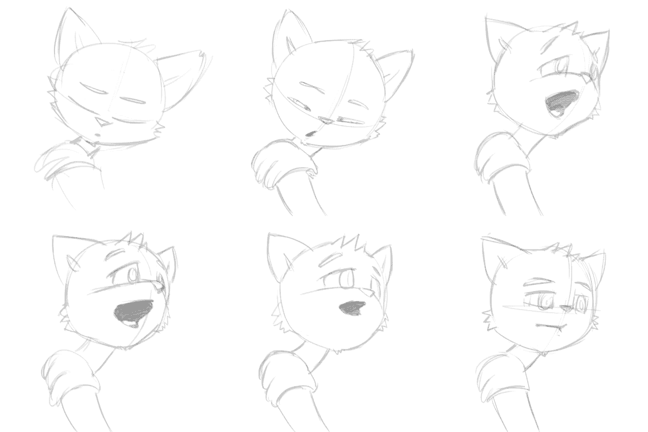
Yeah, I said I was about to begin working with that. And I am! I've been testing out some ways of making characters talk. Right now I just have a cat making some "ahhm" or "miau" expression.
<><><><><><><>
And time for some drawing!
The illustration I was working on for the past weeks is finished!
Yes, I decided to end it up just before I began to smooth out the brush strokes, which, I believe, add a lot to the entire picture.
I'm quite happy with this one because of tons of reasons!
I'm finally beginning to understand how a picture can create a story, revolve around some characters, and make people imagine something. It's really fascinating how with a single frame you can say so much ^^. I'm eager to work on some more illustrations, with better stories, different places, techniques, etc.
---
THE ANIMATOR.
Browsing some art sites, animation articles, and blogs, I found the animator. It is quite easy to just think of an animator as the guy that makes funny characters move, but there is much more to it, and if I want to be one, I'de better understand it.
Artists, as people with the possibilities to create new ideas from almost anything, have to make decisions. An animatior might be an artist, that is, it has to make decisions, art decisions, but also, animation decisions. To be an animator then involves someone to act and think as both, an artist and an animator. But, how is it different one from another?
Well, the artist would make decisions on how colors may be used, how figures represent ideas, how composition may help tell a story, etc.
An animator decides how stuff moves, why, and how that movement adds to the character [pathos] of a certain being.
That said, I just noticed I haven't done much of any.
I've drawn, yes, and I've animated, yes, but have not yet made my brain think as an animator.
Studies, just like the ones artists make to find the perfect color combination(palettes), the best way of portraying someone, or the ones animators make to invent a new walk, are the fundamental element on such a career. The lack of it may be the reason there are frustrated guys that want to animate, bad animations, mediocre studioes, etc.
That's why I decided to begin my journey on a much more concrete and practical way of studying. Here are some of starters:
 |
| Boring blue parrot. It seems pastels look better if not smudged, at least on grainy papers. |
 |
| A weird steampunk car. Made on a smoother paper, pastels were smudged here. |
These two are some quick pastel studies with two main purposes:
1.- find out how to use pastels
2.- create some color studies, only choosing among just 36 colors. (I will use this on digital pics too)
---
This sketches were some design studies of NEOFELIS NEBULOSA | CLOUDED LEOPARD.
I was looking for a way of simplifying the animal's figure into an appealing design.
I also tried to make some designs following china and aztec cultures.
And that's all for today!
Thanks for reading ^^


